HOUSING DEVELOPER LOGOS
As seen on CBS 4 News and KFOX 14 News!
Brief
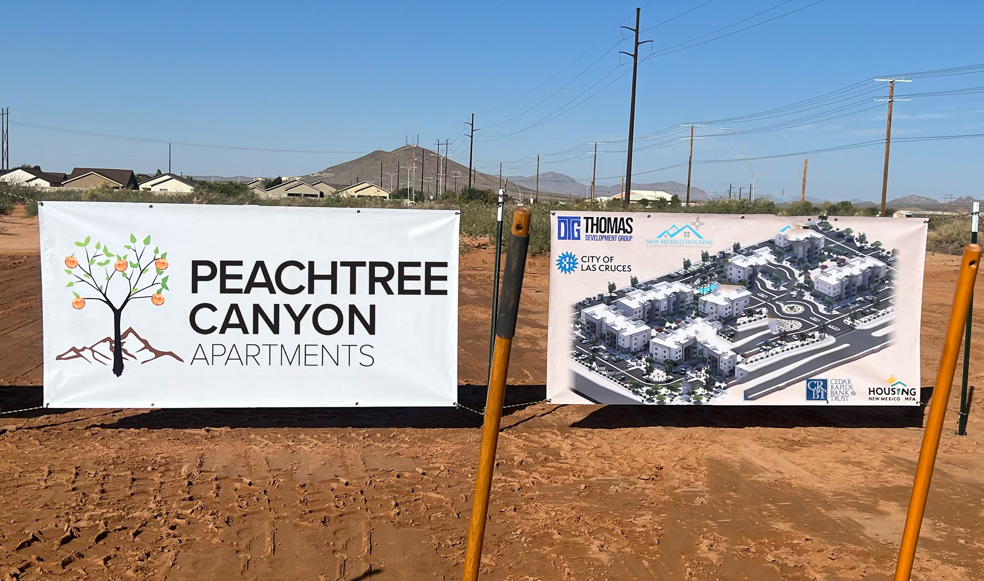
Design two logos for "Peachtree Canyon Apartments" and "Thomas Development Group." The "Peachtree" logo should have a drawing of a peach tree and a clean simple sans serif font. "Thomas Dev. Group" should have a more industrial looking logo using the DTG letters, a sans serif font, and a blue color.
Concept
The "Peachtree Canyon Apartments" logo uses appropriate colors for the peach tree, leaves, and mountain. The simple sans serif font is similar to other housing developer companies and we wanted to keep it in that realm. The "Thomas Development Group" wanted to design a client facing logo for their longstanding company. The three letters on their logo form a square which is appropriate for the real estate development and building industry. Using sans serif letters added to the modern look. We used the blue color to accentuate a traditional, trustworthy feeling.


SMC Music Department Logo on Billboard

Brief
Redesign a logo for Santa Monica College Music Department.
Concept
I redesigned a logo for the SMC Music Department. The client wanted it to be more edgy. The original logo also had some design issues. The bold letters and style of Gilbert font emulated this aesthetic. The strings or staff on the letters connect to the subject. The simple sans serif font I used for the top and bottom words matches well with the music word mark. The final logo is showcased on a billboard.

PODCAST LOGO
Brief
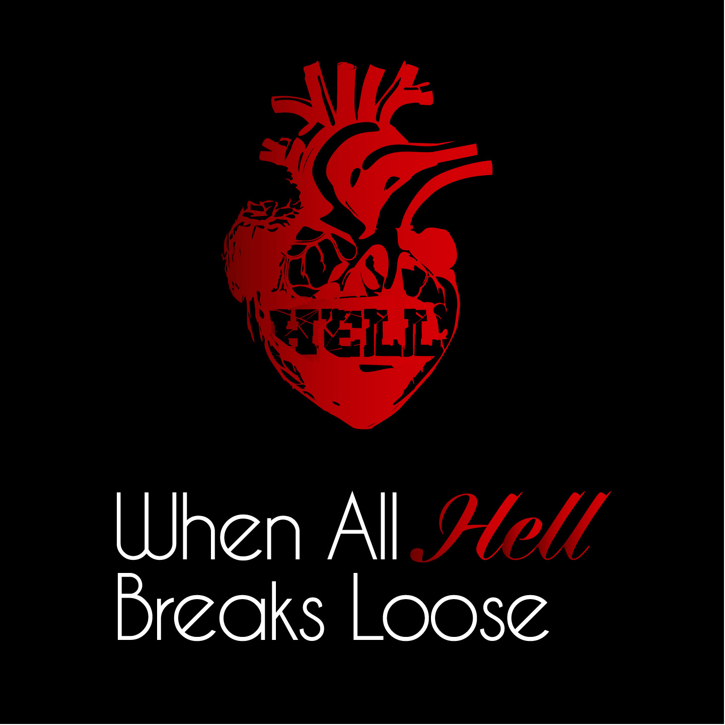
Design a logo for a new podcast called, "When All Hell Breaks Loose." Ideas include: phoenix rising from the ashes, an exploding heart, or a volcano. Use appropriate colors and fonts.
Concept
I designed various versions of the logo in Illustrator and used appropriate fonts and colors for the different themes. The descriptive title is very visual and gave me a lot to work with. The icon was meant to be explosive but contained, so having the black background around the icon made it feel more like a fire erupting in the midst of darkness. Also, using minimal amounts of colors really helped to keep it simple and focused. I gave the client a few choices and they chose the phoenix version.
LOGO OPTION


Brief
Design a logo, promotional materials, a billboard, flyer and website, for Rahwa Daniel to help find her new kidney match. Use her brand colors and image. Make sure it is legible, bold, straightforward, and clearly communicates the message.
Concept
This is a new logo for Rahwa Daniel's The Great Kidney Search. I designed it in Illustrator and used Gelato Luxe and Specter fonts for a bold and clean look. Her message is important, urgent, and needs to be understood within seconds, so I think this clearly communicates that.
I designed a flyer and billboard for Rahwa's The Great Kidney Search. Flyers can be downloaded directly from her website so people can print them and help post them around their city. I used her black and white image and colors to add a dramatic tone. I used the purple to add color to the page without overpowering the message and to keep it simple. We quoted Debra Messing from her empowering video message which further helps promote Rahwa's cause. The flyer has a QR code that connects to the The Great Kidney Search website.
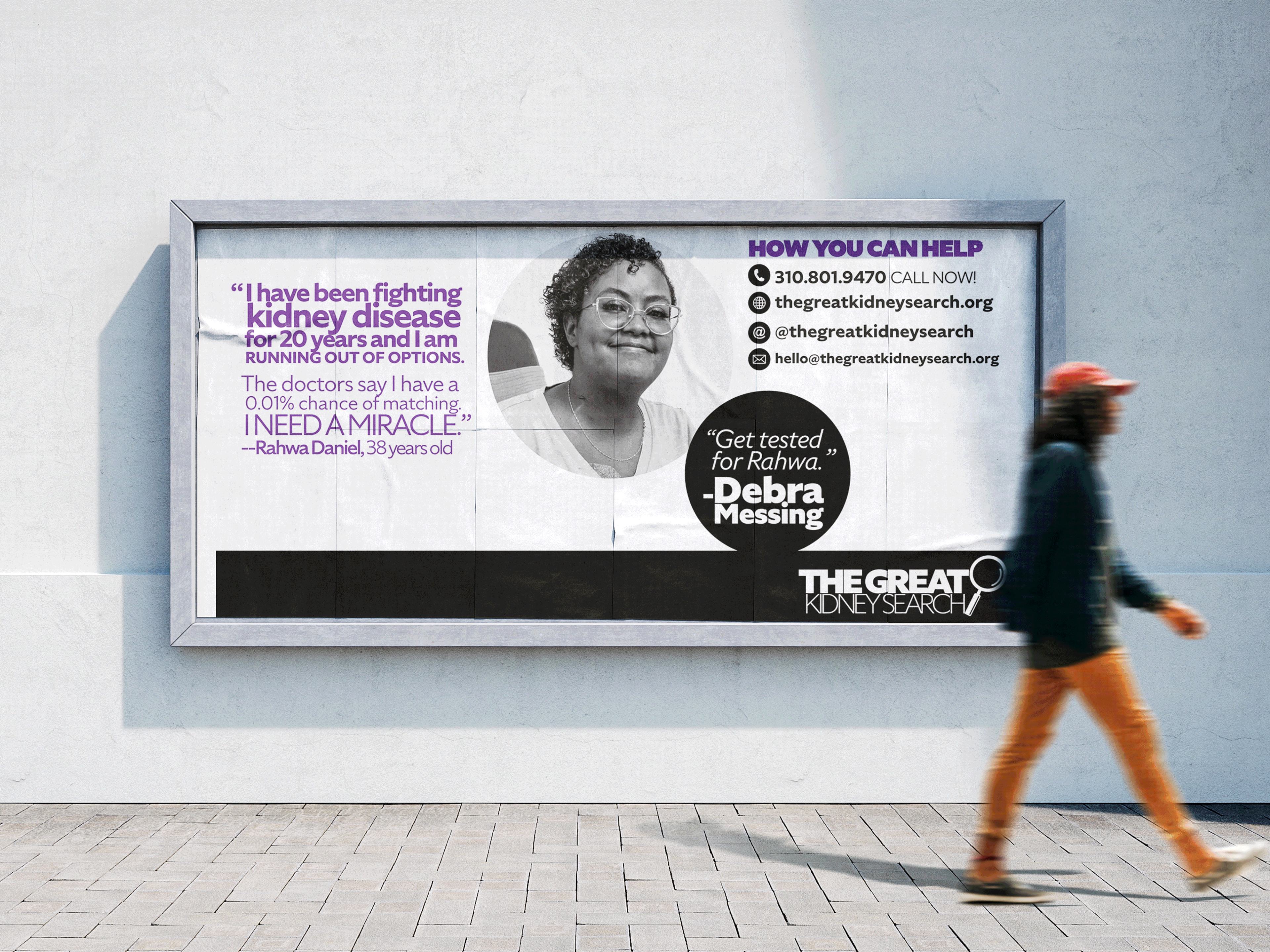
BILLBOARD AND FLYER

LOGO PROCESS

Brief
Design a logo and app for Choir Media, a new independent news outlet. It should have someone reading a book in it.
Concept
This is a new logo for the Choir Media brand and app. I designed it in Illustrator and used Celesse font for a bold and traditional look. I added the illustration of the person reading a book inside the O to add a visual representation of the company.

Brief
Design a new logo for the Culver City Chamber Orchestra.
Concept
This is the children's logo for the Culver City Chamber Orchestra. I drew this cello with sunglasses as a fun image for the children's orchestra. Our group chose these two typefaces for our main logo using a bold condensed typeface for the bottom and a thinner sans serif typeface for the top. They are in all uppercase. The name is long and it was difficult to find a placement that worked for this organization.
Brief
Design a logo, website, and business cards for Tender Times, an End-of-Life doula business. Use a spiral shape and add a heart in the center.
Concept
This is a new logo for Tender Times. The client wanted a spiral with a heart inside. They wanted it to have white space inside the curves which I drew in Illustrator. I used Satisfy font for the name and Futura font for the tagline.
Brief
Design a new logo and redesign the website Original Imprint Birth, a craniosacral and birth doula business. Use spiral mixed with a shell shape for the logo.
Concept
This is a new logo for Original Imprint Birth. I drew it in Illustrator and used MADE Bon Voyage font.

Original Logo

Logo Redesign
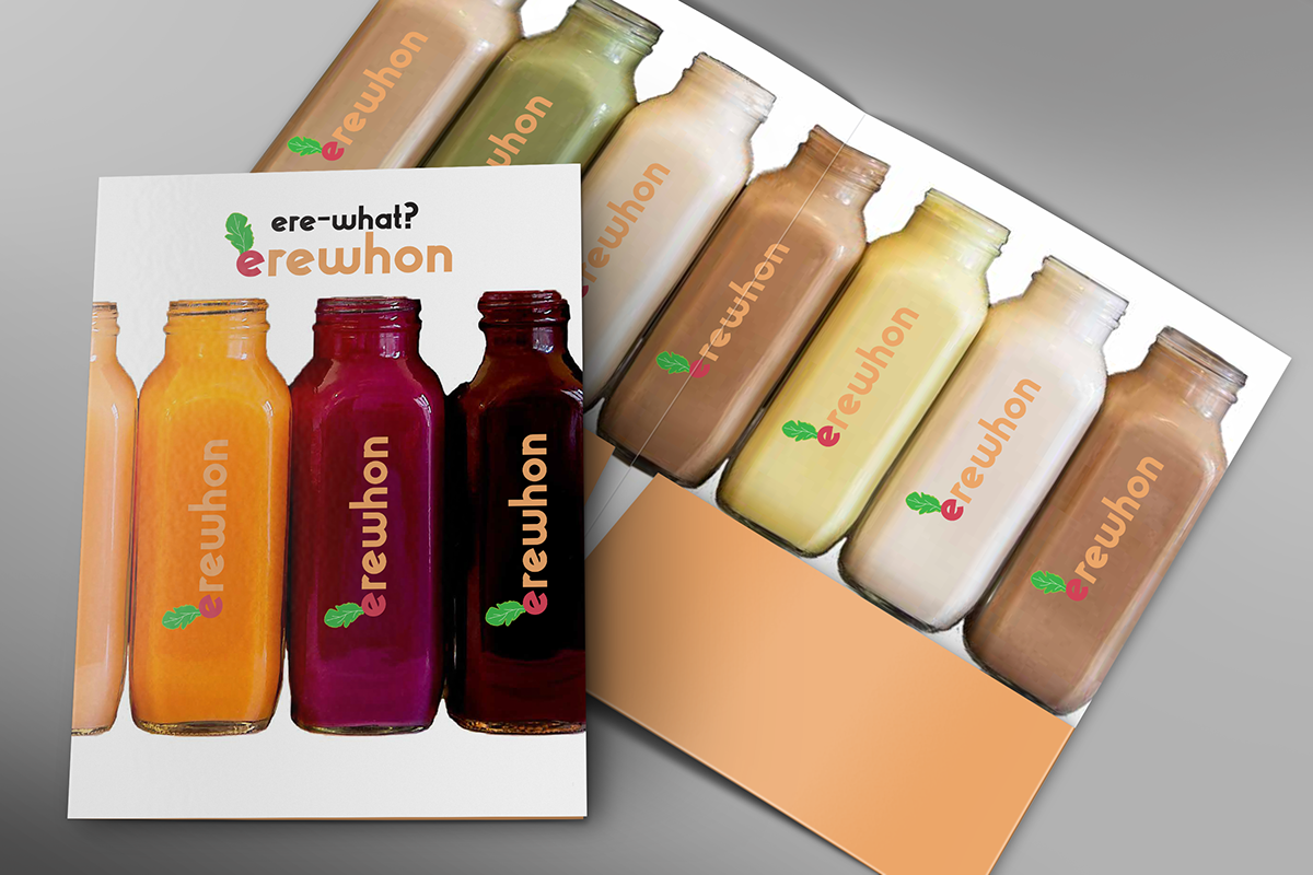
PRESS KIT FOLDER
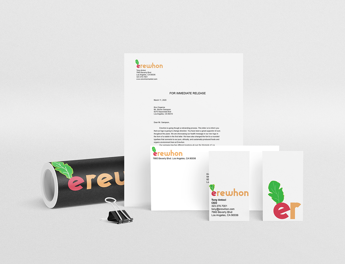
STATIONARY
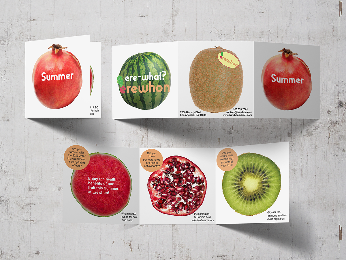
BROCHURE
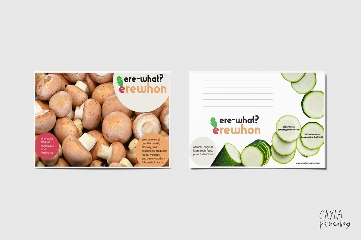
POSTCARDS
Brief
Redesign a logo for a brand you enjoy. Research it, and create a press kit folder, a postcard, brochure, business card, envelope, and press release for the brand. Get feedback and refine the logo and touch points.
Concept
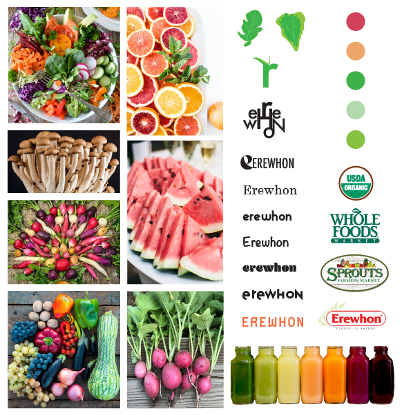
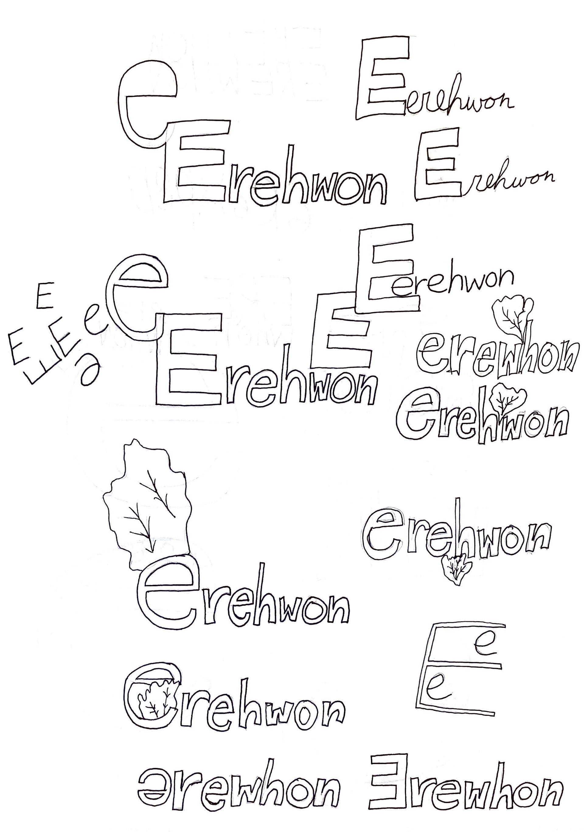
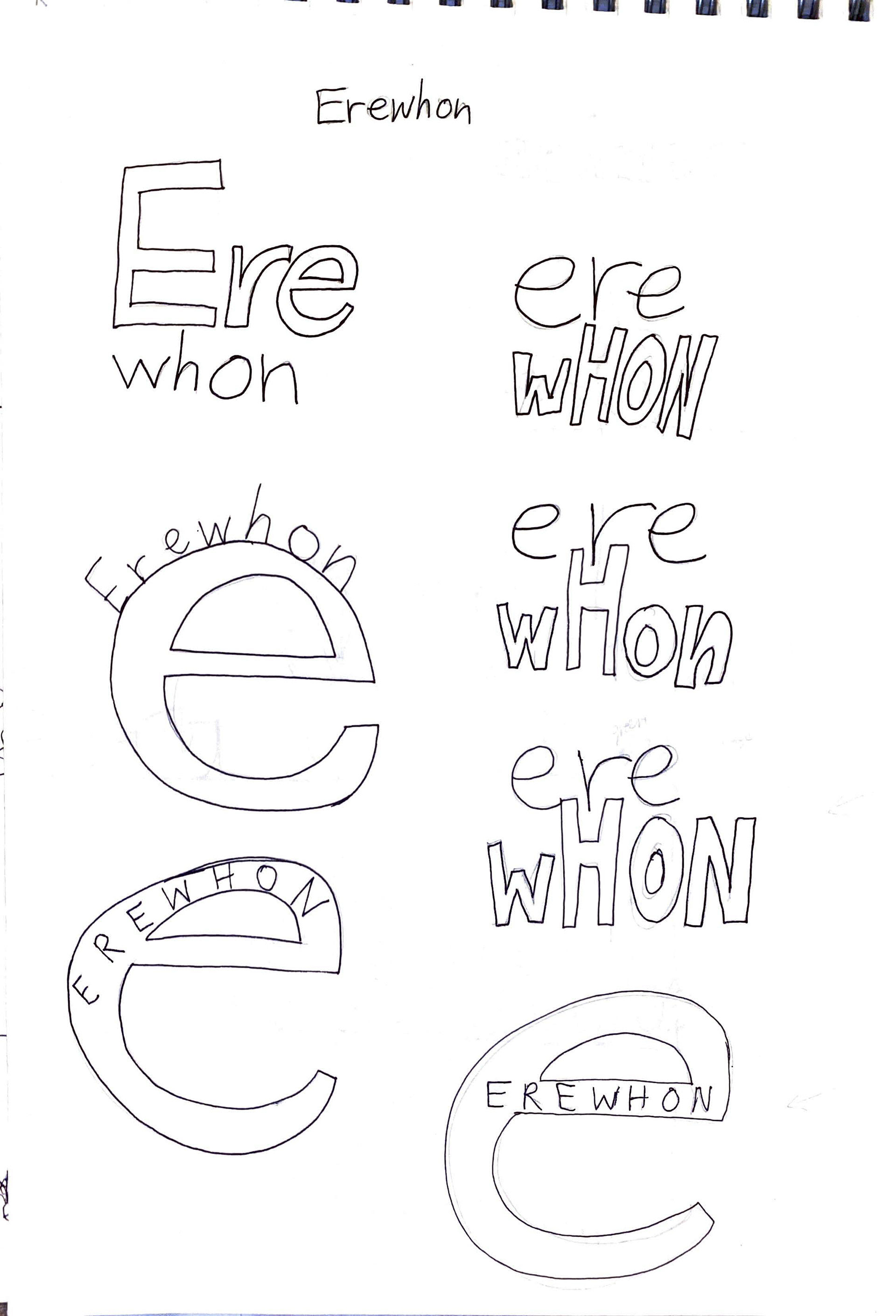
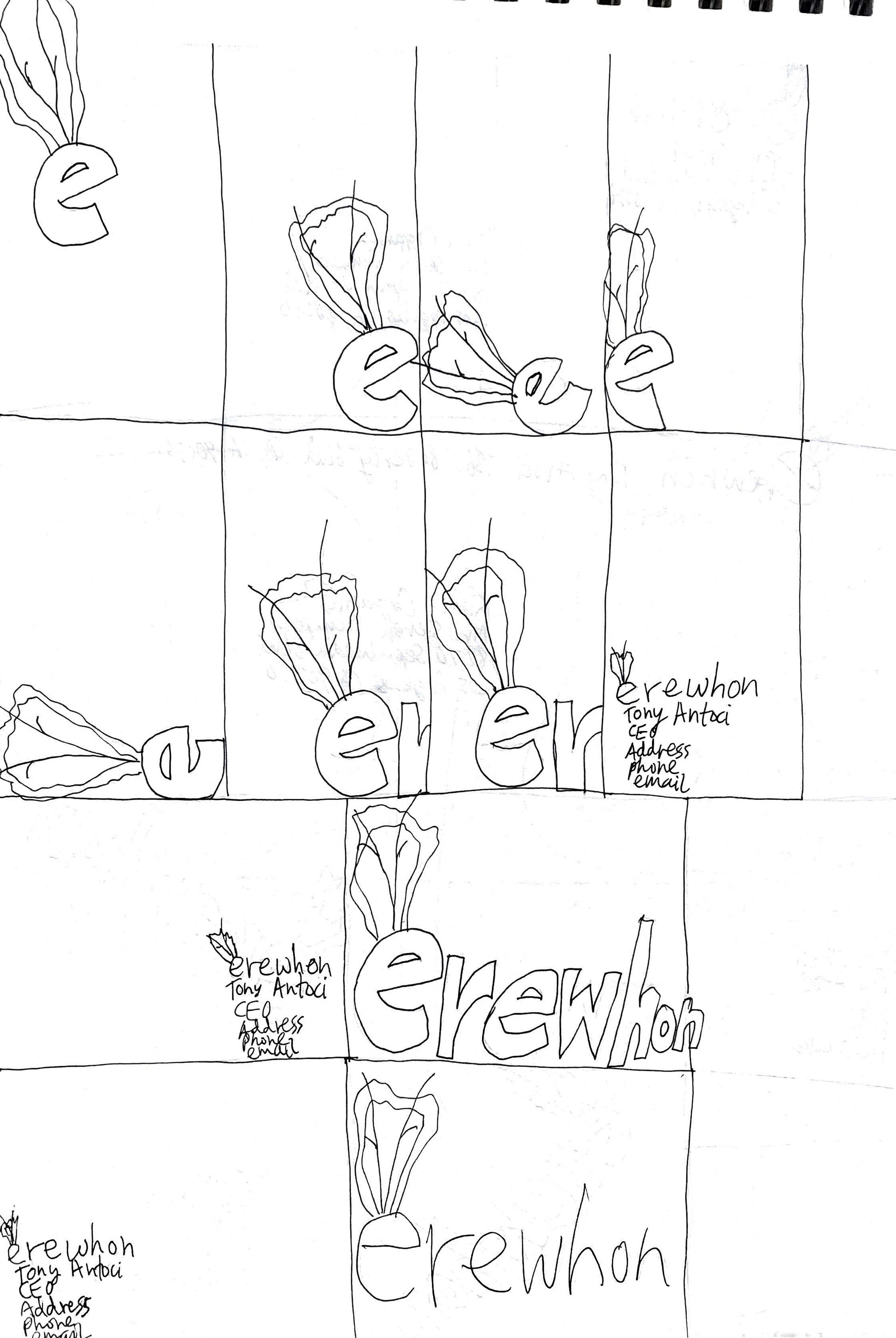
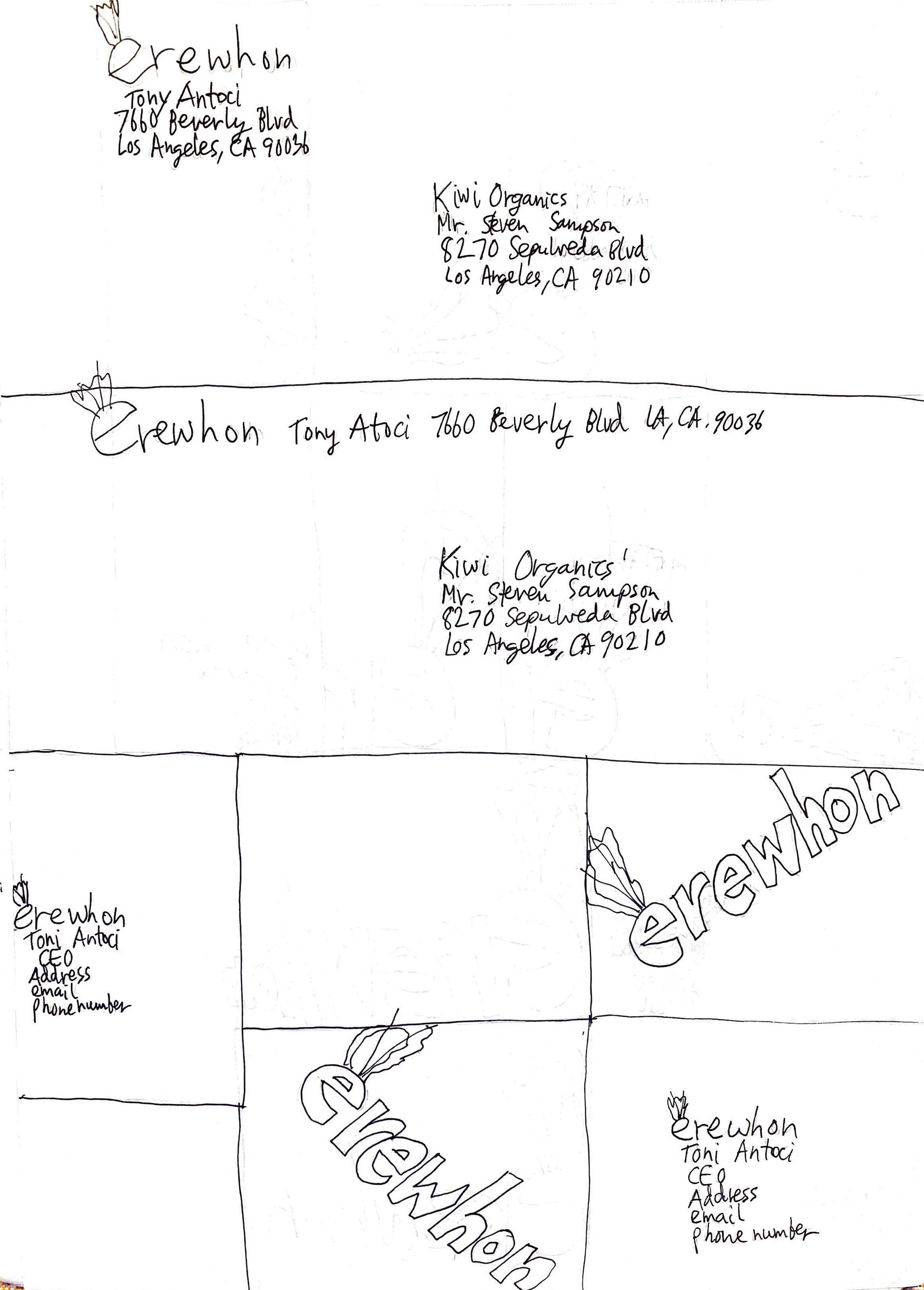
I chose to redesign Erewhon's logo and branding. I added two more colors and a drawing to the logo. I used Gilbert Bold font. I used photos from Unsplash. I stayed within the brand of an all organic grocery store using photos of fruit, vegetables, and their iconic fresh juices in glass bottles.
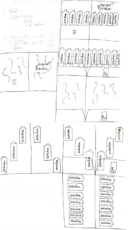
PROCESS
MOOD BOARD AND SKETCHES
SKETCHES