
FLUORITE FONT
Brief
Design an entire typeface. Use tracing paper for rough sketches then transfer them to Illustrator and complete each character design. Transfer them to Glyphs and kern each letter. Create an OTF file. Work on it throughout the semester, get feedback during critiques. Create uppercase, lowercase, or unicase font or a combination of two. Design numerals and punctuation, one glyphs poster, and one creative poster with your typeface.
Concept
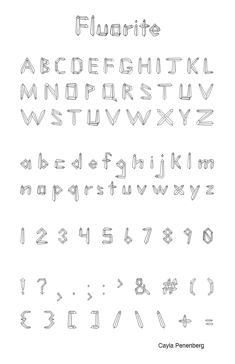
Ever since Cayla was a child she collected crystals and minerals. It was only natural that she was drawn to design a typeface that reflected these shapes. In a matter of a few weeks Fluorite Font was created, critiqued, and completed. The angular style was born after many revisions. After designing the first draft, she was made aware by her colleagues that the letters looked more like pencils than crystals. So she started tapering the strokes to make them look more like fluorite points. There are thin lines with hollow counter shapes connecting to each other from different angles. The letters have a fun, playful nature and look different than any pre-existing crystal typeface. The characters are three dimensional, illustrative, and unique. Each having their own personality yet consistent as a system. Cayla says this was fun but a tedious process. You’ll have to wait and see what she designs next.
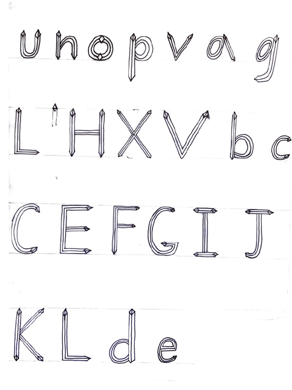
SKETCHES & ITERATIONS

POSTER
Brief
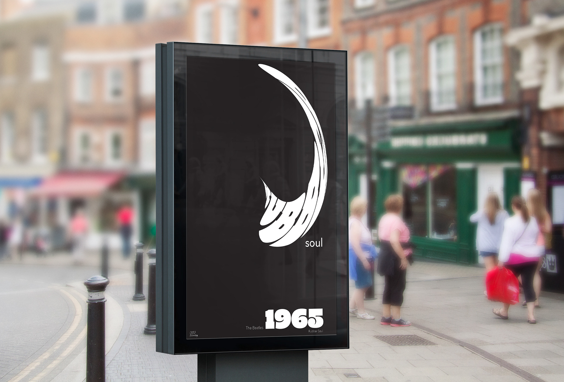
Create a poster about an event that happened on your randomly chosen year. Include the year in your design. You may only use black and white colors and type in your design.
Concept
I chose the Beatles’ Rubber Soul album which came out in 1965. I liked the style of the large heavy bottom letters they used for the word Rubber. I warped the word Rubber to create movement on the page. It is a work of art on its own. I aligned the rest of the type including the word soul and the year below it on the right side of the page. The rest of the page utilizes white space to create a more dynamic environment.

CARDS
Brief
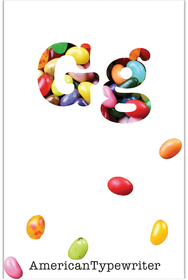
Create four mini cards with a different typeface for each one. Relate them to an object or concept within an overall theme. Each one will include a front and back. These were printed on card stock and presented to class.
Concept
I chose round candies for my theme. I related the qualities of each one with a different typeface and then designed the pages accordingly. I used justified type for the description pages and added drop caps in a color from the color palette. I edited photos in Photoshop. I used the same images on the front and back sides, the back just has less opacity.